10 Quick Accessibility Fixes for Small Business Websites
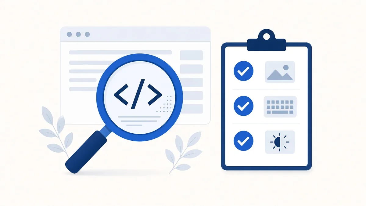
You don't need to rebuild your site to make real progress. Most accessibility problems on small business websites come from the same short list, and many take minutes to fix in WordPress, Wix, Squarespace, Shopify or HighLevel. Here are ten to start with, roughly in order of impact.
1. Add useful alt text to images
Alt text is a short description a screen reader reads in place of an image. Describe what matters about the image in context: "Owner Maria trimming a customer's beard" is better than "image1.jpg" or "barber." If an image is purely decorative, mark it decorative or leave the alt empty so it's skipped. If an image contains text, like a flyer or menu, put that text on the page as well.
2. Fix low-contrast text
Light gray text on white is the most common problem WebAIM finds on home pages. Aim for a contrast ratio of at least 4.5 to 1 for normal text and 3 to 1 for large text. Free tools such as the WebAIM Contrast Checker will tell you in seconds. Pay special attention to text over photos and to buttons in brand colors.
3. Label every form field
Each field needs a visible label tied to it, not just placeholder text that disappears when someone starts typing. Most site builders have a "label" setting; turn it on. Mark required fields in words, not only with color or an asterisk, and make error messages say what went wrong and how to fix it.
4. Use real headings in order
Screen reader users often jump from heading to heading to scan a page. Use one main heading (H1) per page, then H2s for sections and H3s inside them. Don't pick a heading level just because you like its size; change the style instead.
5. Make links and buttons say what they do
"Click here" and "Learn more" don't make sense out of context. Write "See our pricing" or "Book a haircut." Icon-only buttons, like a shopping cart or a social media icon, need a text label behind the scenes.
6. Check that everything works with a keyboard
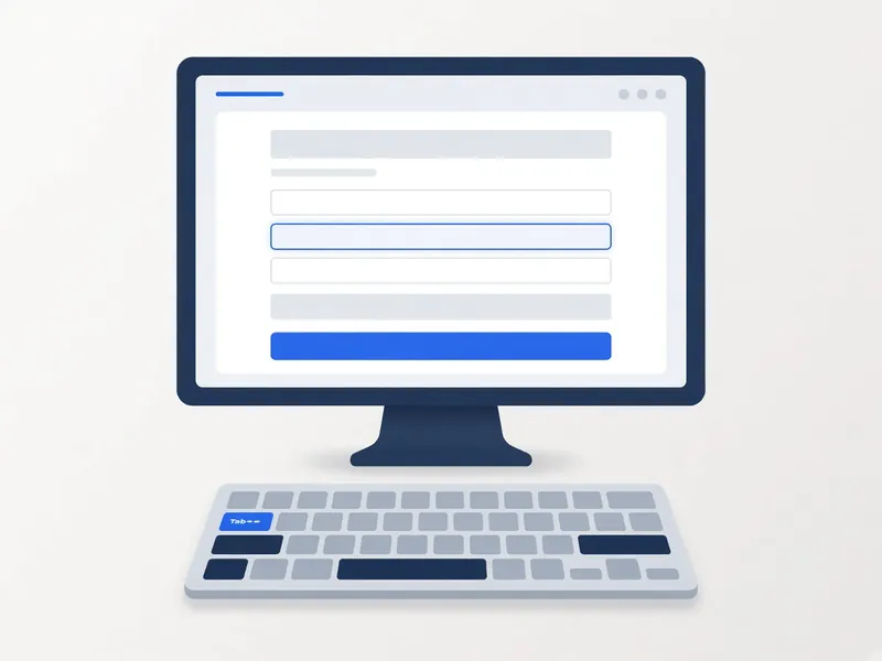
Put your mouse away and press Tab through your home page, menu, booking form and checkout. Can you reach and use everything? Can you see where you are? If the focus outline is missing, ask your developer to restore it. Watch for pop-ups you can't close with the Escape key.
7. Add a "skip to main content" link
Keyboard users shouldn't have to tab through your whole menu on every page. A skip link that appears on the first Tab press solves this. Many modern themes include one; make sure it's turned on and works.
8. Caption your videos
YouTube and most video platforms create automatic captions, but they make mistakes, especially with names and prices. Review and correct them. For audio-only content such as podcasts, post a transcript.
9. Don't rely on color alone
If a sale price is shown only in red, or a required field is marked only by a red border, some visitors will miss it. Add a word, an icon or a pattern as well.
10. Set the page language and let text resize
Your site should declare its language (usually a simple setting) so screen readers pronounce words correctly. Then zoom your browser to 200% and check that text doesn't overlap or get cut off and that nothing forces visitors to scroll sideways on a phone.
Before and after examples
| Before | After |
|---|---|
| Image alt text: "IMG_4521.jpg" | "Finished kitchen remodel with white cabinets and a quartz island" |
| Link text: "Click here" | "See our kitchen remodel prices" |
| Form field with only placeholder text "Email" | Visible label "Email address" connected to the field |
| Light gray text (#aaa) on white | Dark gray text (#555 or darker) on white |
| Error shown only as a red border | "Please enter a phone number with 10 digits" |
| Menu that opens only on mouse hover | Menu that opens with Enter or Space and closes with Escape |
Your printable checklist
- Every meaningful image has alt text, and decorative images are marked decorative
- Text passes a 4.5:1 contrast check (3:1 for large text)
- Every form field has a visible, connected label
- One H1 per page, with H2 and H3 in order
- Links and buttons describe where they go or what they do
- Everything works with Tab, Enter, Space and Escape, with a visible focus outline
- A skip link appears on the first Tab press
- Videos have reviewed captions, and audio has a transcript
- Color is never the only signal
- Page language is set, and the page works at 200% zoom
- An accessibility statement with contact details is published
How long these fixes take
On a typical 10-page small business site, an owner comfortable with their site builder can usually work through items 1, 2, 5 and 9 in an afternoon. Labels, keyboard support and skip links may need a developer if the theme doesn't support them, but they're usually small jobs. Captioning depends on how much video you have.
Bonus: publish an accessibility statement
A short page that says what you've done, what you're working on and how to reach you if something doesn't work shows good faith and gives visitors a way to get help.
How to check your work
Automated tools are a great start. Our free scan runs axe-core against WCAG 2.2 A and AA rules and explains each issue in plain English. Automated tests catch many common problems but not all of them, so also try the keyboard test above and, if you can, a quick pass with a free screen reader such as NVDA on Windows or VoiceOver on Mac and iPhone.
Keep it going
Accessibility isn't a one-time project. Every new page, product or plugin can bring problems back. Put a short check on your monthly to-do list, or let a monitoring service rescan for you and flag new issues. Small, steady fixes add up, and every one makes your site easier for real customers to use.
Frequently asked questions
Do I need a developer for these fixes?
Not always. Alt text, link text, headings and captions can usually be done in your site builder. Keyboard and focus issues sometimes need a developer.
Which fix matters most?
It depends on your site, but form labels and keyboard access often block the most important tasks, like booking or buying.
Will an automated scan find everything?
No. Scans catch many common issues but not all. Pair them with a keyboard test and, ideally, a screen reader check.
How often should I recheck?
After any major change, and at least monthly if you add content often.
Comparing tools? See our accessibility widget comparison.
Sources
- W3C WCAG 2.2 quick reference
- WebAIM Million (most common errors)
- WebAIM Contrast Checker
- ADA.gov: Guidance on web accessibility and the ADA
Disclaimer: This article is general information, not legal advice. Laws and dates can change. A toolbar alone doesn't make a website conform; we help reduce risk and improve access.