Accessible Colors and Fonts: Contrast Ratios and Readable Type
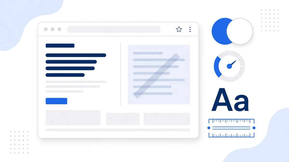
If you could fix only one thing about how your website looks, contrast would be a strong pick. Light gray text on a white background might look sleek in a design mockup, but for many visitors it's hard or impossible to read. That includes people with low vision, people with color vision differences, older adults whose eyes need more contrast, and anyone checking your site on a phone in bright sunlight.
This post walks through what the Web Content Accessibility Guidelines (WCAG) actually ask for on color and text, how to check your own site in a few minutes, and the type choices that make pages easier for everyone to read.
Why contrast is worth your attention
Every year, the nonprofit WebAIM tests the home pages of the top one million websites. In its February 2026 analysis, low contrast text was the single most common problem it detected, found on 83.9% of home pages, up from 79.1% the year before. The average home page had 34 separate instances of text that fell below the WCAG thresholds.
That's actually encouraging news for a small business. Contrast is one of the easiest problems to find and one of the cheapest to fix. In most cases it means changing a few color values in your theme settings, not rebuilding your site.
What a contrast ratio is
A contrast ratio compares how light the text color is with how light the background behind it is. The scale runs from 1:1, which is the same color on itself and invisible, up to 21:1, which is pure black on pure white. The higher the number, the easier the text is to pick out.
You don't need to do the math by hand. A contrast checker takes two color codes and gives you the ratio. To give you a feel for the numbers, here are a few common colors measured against a white background:
- #999999 (a light gray used for "subtle" text): about 2.85:1, which is too low for body text.
- #767676 (a medium gray): about 4.54:1, just over the line for normal text.
- #595959 (a dark gray): about 7:1, comfortable for almost everyone.
- #1d4ed8 (the blue we use on this site): about 6.7:1.
The numbers WCAG asks for
WCAG 2.2 is the standard most U.S. accessibility discussions point to, and Level AA is the level most often referenced, including in the Department of Justice's rule for state and local government websites. Here's what it says about color, in plain English.
Text: 4.5:1, or 3:1 if it's large
Success criterion 1.4.3, Contrast (Minimum), asks for a ratio of at least 4.5:1 between normal text and its background. Large text only needs 3:1, because bigger letters are easier to see. WCAG treats text as large when it's at least 18 point (roughly 24 CSS pixels) or at least 14 point bold (roughly 18.66 CSS pixels).
There are a few exceptions. Logos and brand names don't have a contrast requirement, and neither does text that's purely decorative, part of an inactive control, or incidental, like words in the background of a photo. There's also a stricter Level AAA criterion, 1.4.6, that asks for 7:1 for normal text. It's a good target for long reading pages, but it isn't usually the baseline.
Buttons, fields and icons: 3:1
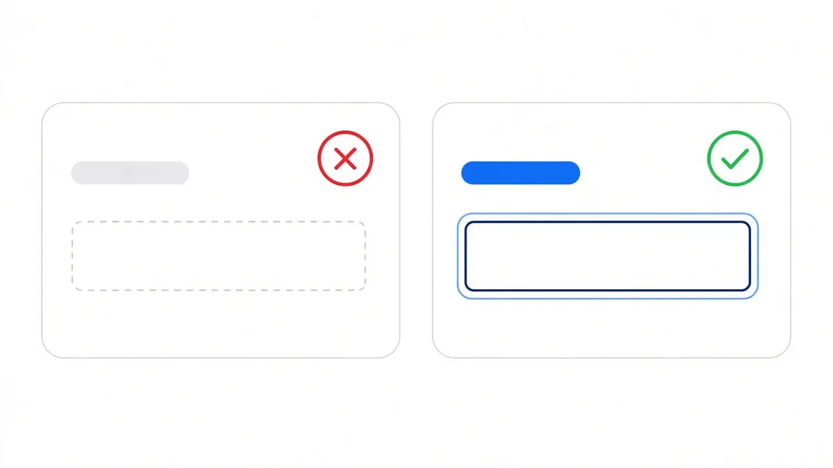
Success criterion 1.4.11, Non-text Contrast, covers the parts of a page people need to see in order to use it. The visible edges of form fields, the outline of a button, the focus indicator that shows where you are when you press Tab, and icons that carry meaning should all have at least 3:1 contrast against the colors next to them.
This is where many modern designs slip. A text box drawn with a faint gray border can practically disappear, and some visitors can't tell where to click or type.
Don't use color alone
Success criterion 1.4.1, Use of Color, says color shouldn't be the only way you communicate something. A common example is a form that only turns a field's border red when there's an error. Someone who can't tell red from gray won't know anything is wrong. Add a short text message and an icon too. The same goes for links inside a paragraph: underlines help people spot them without relying on color.
Readable type is more than color
Good contrast won't help much if the letters are tiny or crammed together. A few WCAG criteria and some plain common sense cover the rest.
- Let people zoom. Success criterion 1.4.4, Resize Text, asks that text can be enlarged to 200% without losing content or features. Don't block zooming on mobile, and test your pages at 200% in a desktop browser.
- Leave room to breathe. Success criterion 1.4.12, Text Spacing, asks that nothing breaks when a visitor increases line height to 1.5 times the font size, paragraph spacing to 2 times, letter spacing to 0.12 times and word spacing to 0.16 times. Fixed-height boxes that cut off text are the usual problem.
- Pick a sensible base size. WCAG doesn't set a minimum font size, but many designers start body text around 16 CSS pixels and size headings up from there.
- Choose clear typefaces. Fonts with distinct letter shapes, where a capital I, a lowercase l and the number 1 look different, are easier to read. Save thin, decorative and script fonts for short headings, if you use them at all.
- Keep lines a comfortable length. Very long lines are tiring to track. Left-aligned text is generally easier to read than fully justified text, which can create uneven gaps between words.
- Use real text, not pictures of text. Text inside images can't be resized cleanly, isn't read by search engines, and needs alt text to reach screen reader users.
Readable text also helps the people who never think of themselves as having a disability. We covered that overlap in how accessibility helps SEO and sales.
How to check your own site in 15 minutes
- Run an automated scan. Tools built on axe-core, including our free website scan, flag text that fails the contrast ratios and show you exactly which elements to fix.
- Check your brand palette. Put your main text, link, button and background colors into a contrast checker, such as the free one from WebAIM. Write down which combinations pass for normal text, which only pass for large text, and which fail.
- Look at the hard spots. Automated tools can't always judge text on top of photos, gradients or videos. Look at your hero banners and image overlays yourself. A solid or semi-transparent dark panel behind the text usually solves it.
- Press Tab through a page. Can you always see where you are? If the focus outline is faint or missing, that's a 1.4.11 issue worth fixing.
- Zoom to 200%. Make sure nothing overlaps, gets cut off or disappears.
Automated scans are a great start, but they don't catch everything. Pair them with a quick manual look like the one above, and see our 10 quick accessibility fixes for other easy wins.
Fixing contrast without losing your brand
Owners often worry that fixing contrast means giving up their brand colors. It rarely does. Usually you keep the brand color for large headings, backgrounds and buttons, and use a slightly darker shade of it for small text and links. If a light brand color fails on white, try it as a background with dark text on top instead. Many site builders, including WordPress themes, Shopify themes and HighLevel pages, let you change these colors once in the global style settings so the fix applies everywhere.
What about accessibility toolbars with a high-contrast mode? They can be a helpful extra for visitors who want them, but they don't replace good default colors, and a widget alone doesn't make a site conform to WCAG. We explain why in Can a widget alone make a site accessible? If you're comparing products, our accessibility tool comparison lays out what each one does, with sources.
The bottom line
Contrast and readable type are some of the most visible parts of accessibility, and some of the simplest to improve. Check your colors against the 4.5:1 and 3:1 targets, make sure buttons, fields and focus outlines stand out, don't rely on color alone, and let people zoom and adjust spacing without breaking the page.
This article is general information, not legal advice. When you're ready to see how your colors and text hold up, run a free scan of your site and get a list of what to fix first.
Frequently asked questions
What contrast ratio does WCAG require for text?
At Level AA, WCAG 2.2 asks for at least 4.5:1 for normal text and 3:1 for large text, which is about 24 CSS pixels regular or 18.66 CSS pixels bold.
Do buttons and form fields need to meet a contrast ratio?
Yes. Under WCAG 1.4.11, the visible parts people need to identify controls, like field borders, button edges and focus indicators, should have at least 3:1 contrast against adjacent colors.
Does my logo have to meet contrast requirements?
No. WCAG exempts text that is part of a logo or brand name, as well as purely decorative text.
Is there a minimum font size for accessibility?
WCAG doesn't set one, but it does require that text can be resized to 200% without losing content. Many designers start body text around 16 CSS pixels.
How do I check my site's color contrast?
Run an automated scan to find failing text, test your brand colors in a contrast checker, and manually review text placed over images or gradients.
Comparing tools? See our accessibility widget comparison.
Sources
- WebAIM: The WebAIM Million, 2026 report
- W3C: Understanding Success Criterion 1.4.3, Contrast (Minimum)
- W3C: Understanding Success Criterion 1.4.11, Non-text Contrast
- W3C: Understanding Success Criterion 1.4.1, Use of Color
- W3C: Understanding Success Criterion 1.4.4, Resize Text
- W3C: Understanding Success Criterion 1.4.12, Text Spacing
- WebAIM: Contrast Checker
Disclaimer: This article is general information, not legal advice. Laws and dates can change. A toolbar alone doesn't make a website conform; we help reduce risk and improve access.